
Pillar Guide
Interior Design Basics: An Editorial Primer
The grammar of beautiful rooms — proportion, scale, balance, rhythm, light, color, and texture, written for first-time decorators and seasoned ones alike.
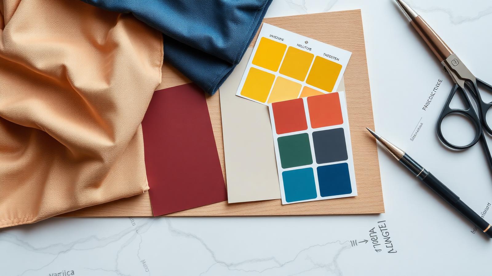
Interior design has its own grammar. Once you understand a few core principles — proportion, scale, balance, rhythm, light, and palette — you can apply them in any room, any style, any budget. This is the editorial primer we wish every first-time decorator started with.
Principle 1: Proportion and scale
Proportion is the relationship between parts; scale is the relationship between an object and the room. The most common mistake in beginner rooms is scale: a too-small rug, a too-small chandelier, a coffee table that disappears in front of a large sofa. As a rule, go bigger than you think. A single oversized piece will almost always read as more sophisticated than three properly-sized ones.
Principle 2: Balance
Balance can be symmetrical (matching lamps on either side of a sofa) or asymmetrical (a tall floor lamp on one side, a stack of books and a small lamp on the other). Symmetrical balance reads as formal and calm; asymmetrical balance reads as collected and modern. Most rooms benefit from a mix.
Principle 3: Rhythm and repetition
Repeat each color, each material, and each shape at least three times in a room. The eye reads repetition as intention. A black picture frame, a black lamp base, and a black throw pillow on a neutral sofa creates a sense of cohesion that no single statement piece can.
Principle 4: Light
Lighting is the single most underrated element in design. Aim for three sources at three heights in every room — overhead, mid-level (table or floor lamp), and low (candles, accent lighting). Use warm 2700K bulbs and put everything on dimmers. A modest room with good lighting reads as expensive; an expensive room with bad lighting reads as a furniture showroom.
Principle 5: Color
Pick a palette and commit. The classic 60/30/10 rule (60% dominant, 30% secondary, 10% accent) is a reliable starting point. Test paint colors in the actual room at different times of day before committing — paint shifts dramatically under different light.
Understanding undertones
Every neutral has an undertone — warm (yellow, red), cool (blue, green), or balanced. Neutrals with mismatched undertones fight each other and make a room feel "off" without an obvious reason. Group warm with warm, cool with cool, and reserve high contrast for intentional moments.
Principle 6: Texture
Texture is what saves neutral rooms from looking flat. Mix at least four textures in any room: smooth (glass, polished stone, lacquer), rough (boucle, jute, raw wood), soft (linen, velvet, wool), and hard (metal, ceramic, leather). Texture is also why expensive-looking rooms photograph well — the eye reads richness even when the palette is restrained.
Principle 7: Negative space
Empty space is a design choice, not a failure. Coffee tables, shelves, and walls all benefit from intentional negative space. The rule of thirds applies — group objects in odd numbers and leave clear "rest" zones for the eye.
Building a room from scratch
Step 1: Measure honestly
Sketch the room with measurements. Note window positions, ceiling height, door swings, electrical outlets, vents. Bad floor plans can't be redeemed by good furniture.
Step 2: Define the function
What actually happens in this room? Daily living? Hosting? Reading? Children's play? The function dictates the layout.
Step 3: Choose the anchor
Pick the one piece everything else negotiates with — usually the sofa in a living room, the bed in a bedroom, the table in a dining room.
Step 4: Build the palette
Three to five colors total, including a dominant neutral, a secondary neutral, an accent, and a metal.
Step 5: Layer in lighting
Plan lighting before you accessorize. Three sources at three heights, all on dimmers.
Step 6: Add textiles and texture
Rugs, curtains, throws, pillows. This is where the room starts to feel like itself.
Step 7: Edit
Style accessories, then walk away for an hour. Come back and remove a third. Let the room breathe.
The five most common beginner mistakes
- Rugs that are too small. Front legs of major seating belong on the rug.
- Curtains hung too low or too narrow. Mount close to the ceiling and extend well past the window frame.
- Furniture pushed against every wall. Pull pieces in for conversation; leave breathing room.
- Mixing too many woods or metals randomly. Limit to two of each, intentionally repeated.
- Buying everything at once. The best rooms are collected over time.
Style families to know
- Modern: warm whites, curved silhouettes, sculptural lighting, restraint.
- Mid-century modern: walnut, tapered legs, mustard and teal accents, low profile.
- Scandinavian: white walls, light wood, wool and linen, abundant natural light.
- Japandi: Japanese restraint meets Scandinavian warmth — earthy palette, low furniture, generous negative space.
- Traditional: rich woods, symmetrical layouts, layered patterns, formal balance.
- Industrial: exposed brick and metal, leather, oversized lighting, raw materials.
- Maximalist: layered patterns, saturated color, collected objects, more is more.
Frequently asked questions
What's the easiest way to make a room feel more expensive?
Better lighting and a larger rug. In that order.
How do I pick the right paint color?
Buy sample pots, paint a 2x2 ft square on each wall of the room, and live with it for at least 48 hours under different lighting before committing.
Should I match my wood tones?
Limit yourself to two wood tones per room and repeat each at least twice. Don't try to match exactly — intentional contrast reads better than a near-miss.
How do I mix metals?
Pick a dominant metal (90%) and one accent metal (10%). Brushed brass mixes well with matte black and brushed nickel; polished chrome is harder to mix.
What's the right ceiling color?
Generally a few shades lighter than your wall color, or a true warm white. Crisp ceiling whites tend to clash with off-white walls.
Once you've internalized these basics, you can decorate confidently in any direction — see our latest articles for applied examples.

Elena Marsh
Editor-in-Chief
Related articles

